12. Bad Visual Quizzes (Part I)
Practice, Practice, Practice
It is time to put your new skills in data visualization to practice. See if you can figure out the questions below!

SOLUTION:
33.54Which is Better?
Believe it or not, the next two plots are of the exact same data. Both of them depict information regarding flights of the USA's Space Shuttle program: whether or not a mechanical failure of O-Ring components occurred, as well as the temperature at the time of flight. A full background of the dataset can be found here.
Use these two plots to answer the quiz questions that follow.
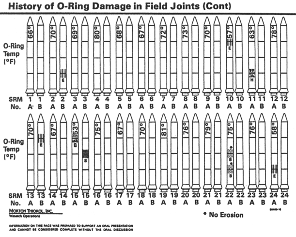
Plot 1
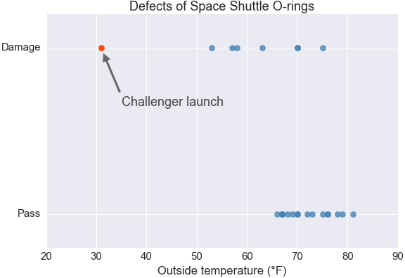
Plot 2
SOLUTION:
Plot 2SOLUTION:
- Temperature appears to be associated with whether an O-ring is damaged or will pass.
- If the temperature is lower than 60 degrees F, no O-rings have ever passed.
- The **challenger** had the lowest temperature of any O-ring on record.
- There are 7 total damaged O-rings in the dataset.